

Follow us on:

Pantone colors have become the universal language for color. You may already know the basics of Pantone colors when it comes to screenprinting, but despite the exact nature of Pantone colors, what you see is not always what you will get. Find out what you need to know about screen printing Pantones on textiles, along with which standard colors to call out when you're printing on an underbase.
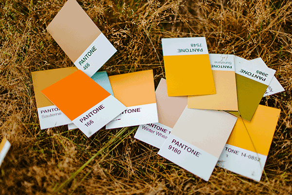
Which Pantone Guide To Use
Pantone has created various color guides for the graphic design and fashion industries, however, screen printing ink systems are limited to Solid Coated or Solid Uncoated only. The color codes are 3-4 digits and end in C (Coated) or U (Uncoated). Of these two, coated colors are more realistically matched by standard plastisol textile inks. If you are selecting colors from any other guide, Pantone has a handy tool that will help you convert the color to a screen print friendly coated color.
The colors in the guide fade and change with use and exposure to light. Good decorators will have clean, up to date Pantone books.

How A Pantone Becomes Screenprint Ink
There are many ink manufacturers that offer systems for matching custom colors. The overall sophistication of these systems and/or equipment used varies, but most are designed to create mixed inks that will print a close match to a Pantone color. There are even some specialty applications that can be mixed to match Pantones.
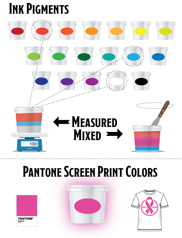
No matter how exactly a color is mixed, one ink system may produce the exact same shade as another. Once the ink is mixed as formulated, screen print may need to spend time in research and development to create a custom color formula for the specific project.
Transparent Colors You Need To Know
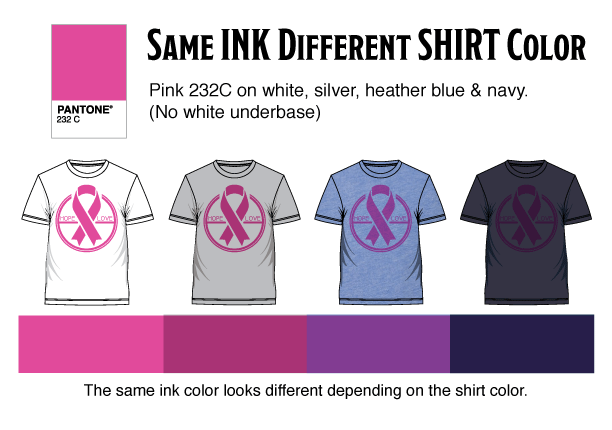
Pantone colors were developed to be printed on white paper, so it makes sense that screen print ink colors will match best when printed on a white shirt. All inks are at least a little bit transparent, so the appearance of color can change based on the material it is printed on. In fact, some colors you see in Pantone books are not achievable on tshirts. Higher quality tshirts will produce higher quality prints.
Screen printers can usually get a close Pantone match on very light colors in addition to white: natural, ash, light pink, or light blue. Other shirt colors can dramatically change the printed ink color. Middle to dark blues and purples are particularly transparent. Process colors and fluorescent colors are also very transparent. The more transparent the ink is, the more the color may change from the shirt.
How Underbases Affect Inks
A white under base is a layer of white ink printed before the design colors are printed. This is the most common solution when printing a Pantone specific ink on a variety of shirt colors. Particularly if you are printing very transparent inks.
That said, an underbase does have a tendency to lighten the printed ink color even if perfectly mixed. Remember, ink is a different material than tshirt fabric, so it will not necessarily look the same. Many times screen printers will choose a full shade darker to achieve a lighter Pantone match.
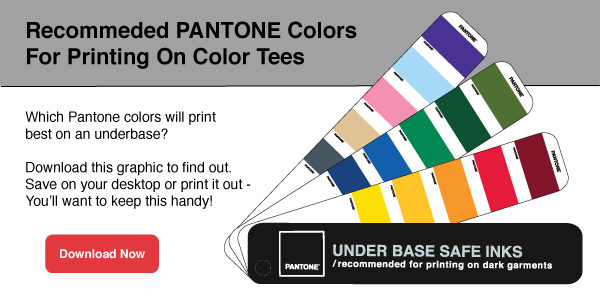
Remember to contact your decorator with questions and leave extra time for custom color development. Don't forget to download the recommended Pantone colors guide for the top selection of the most commonly requested colors.

Leave a Reply
Your email address will remain private and will not be shared.