In order to screen print a design on a t-shirt or other garment, the design must be broken down to the individual color components. The process of isolating each color is called color separation. There may a fee associated with color separation depending on the art file and design.
There are various terms we use to describe the complexity and technical process involved in color separation for a particular design.
Thanks to Roguelephant! A very cool logo
for an example of one color artwork!
Thanks to our friends at Sangha Rising for
the graphic example of one color printing.
Check out their cool art wearables!
Thanks to artist Josh Saathoff & Babbletees
for this beautiful spot color example. Check out
the printed t-shirt!
Thanks again Roguelephant for a killer
example of spot color with halftone.
These images are more illustrative or painterly, not photorealistic, but incorporate many colors in a complex design. Complex spot color separations are used when designs incorporate 3-D effects, transparency, layering, complex gradients, and other effects along those lines.
# OF COLORS: 5-12
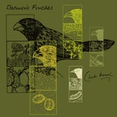
Thanks to artist Matheus Lopes and
Threadless for this great complex spot
separation! Check out the printed tee!
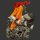
Thanks Sharp Shirter - Megablast is a killer
tee and a great example of complex spot color
separations!
This process mimics an ink jet printer in that cyan, magenta, yellow and black are used for the printing. Color separation using 4 color process is rarely, if ever, used in our shop these days. The print quality and saturation is far superior when we use complex spot color or simulated process. Four color process can only be used when printing on white garments. Direct-To-Garment printing may be a better option than 4CP depending on the desired result. Be sure to consult with a sales rep before ording 4CP.
# OF COLORS: 4
Big thanks to Ian Leino and Threadless for
the simulated print. This t-shirt is hot!
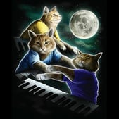
Thanks to Oxen and Threadless for this
purrrrfect example of simulated process.
Three Keyboard Cat Moon!
Pantone colors are the universal language for communicating specific colors right down to the shade. This language overcomes distances and computer monitors with different calibrations.
This guide is meant to give you an understanding of how screen printing inks relate to Pantone® colors. Fill out the form to the right and download your free guide today!