

Follow us on:

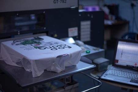 Direct to garment printing is great for a lot of reasons, but the big one is the fact that set up is really fast and minimal. There’s no need for separations, burning screens, mixing ink or setting up a press. While it's not as simple as hitting control+P it is much closer to instant gratification.
If art is good for screen printing, it is generally good for Direct-to-Garment as well. However, there are some art/design elements that will expose the weaknesses of digital printing.
Here’s my top 5:
1. FLATTENED RASTER IMAGES
Flattening a raster image creates white pixels where there might not have been anything before. In some cases this must be removed before printing, sometimes leaving jagged edges, misshapen or discolored in the process. It is often very difficult to remove and can effect the image, so leave the file in layers just in case.
2. BOTH FRONT AND BACK PRINTS ON DARK COLORS
When it comes to DTG on a dark colored shirt, trouble starts with large print areas on the front and back. A pretreat must be applied to dark colored shirts and then heated in a press. Due to this process, when it comes to printing on the back, there will be a visible ring where the collar is on the other side because of the pretreat concentrated there.
3. LARGER AREAS OF SOLID WHITE
White actually looks great on DTG prints as long as you’re not going for a very large solid bright white area. In most situations white is going to look great, but in those big areas, the transparency of the ink tends to be more apparent. To compensate, more white ink must be applied, so much so in these cases, that the ink sometimes pools up into rubbery lumps. Not cool. So, forget that awesome image of a polar bear drinking milk at a P Diddy style all white rooftop party.
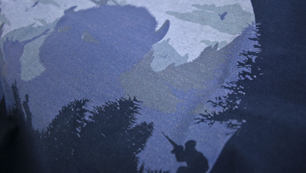
4. BLUES
Blues are tricky. The technology just hasn’t tackled the blue conundrum quite yet. Especially when printed on dark colors, large areas of darker blue tend to look grainy and dull. This means purples or greens with a lot of blue in them are affected as well. Blues on the lighter side tend to fair better. So, printing Cookie Monster eating out of an Oreo package and fishing on the lake is going to look terrible. Back to the drawing board.
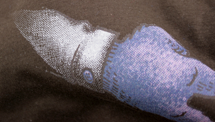
5. TRANSPARENCIES ON DARK COLORS
In my professional opinion, this is the Achilles’ heel of DTG. If there are transparencies in your image that would be meant to utilize the shirt color and it is going on a dark shirt, there’s an instant problem. There is a white under base applied to all images going on dark garments. This goes on under all areas, including that which, in the art, are transparent or faded. Therefore, the printed image shows the under base under the transparency instead of the shirt color. For example, a white to black fade on a black shirt ends up going from white to grey or white to white. There are some clever solutions to this problem, but they are very case sensitive and are not guaranteed to work.
If you ever have any doubt, send your art over to your DTG printer for their opinion on how to improve the graphic for optimal printing.

Leave a Reply
Your email address will remain private and will not be shared.