


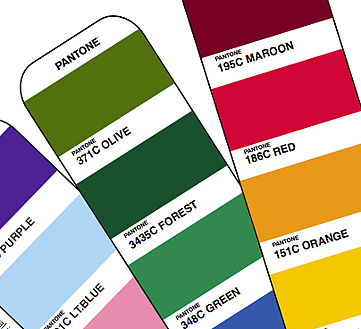
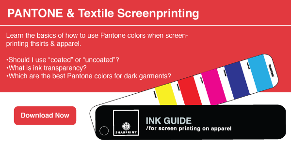
Flipping through a pantone color book is a popular way to choose hues for print products. When both the customer and the manufacturer are looking at the same pantone color, both parties know that they're on the same page. Simply saying "light blue" isn't nearly specific enough when it comes to promotional products. Finding the right color can be difficult enough, but coming up with perfect pairings is even more challenging. Here are some tips for marketing departments who are choosing promotional pantone colors for the first time.
Channel Seasonal Hues
Seasonal colors are always popular on pantone color palettes. Special combinations of pantone colors are often heavily promoted in line with holidays. Custom apparel that will be used for a seasonal promotion will send a clear message with complimentary colors that are associated with that particular time of year.
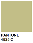
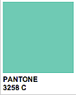
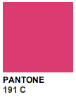
Warm gold, orange, magenta, and chocolate brown evoke images of fall leaves. Crisp blue, silver, and white look icy and cool for winter. Pretty pastels and fresh mint green are easily associated with spring, while sandy beige (Pantone 4525 C), bright turquoise (Pantone 3258 C) and bold pink (Pantone 191 C) have a beachy summer feel. Similar color combinations are available for special holidays, such as the classic combination of orange and black for Halloween.
Choose pantone colors are that targeted to seasonal tastes for promotional gear that will be replaced in a few months. Providing fresh new pieces for each season is a great way to keep things fresh. However, if the company is more interested in a long-lasting design, the following tactics may be better.
Try Complimentary Pairings
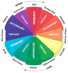
A traditional color wheel is a powerful tool for choosing smart color pairings. Next to the book of pantone colors, this is one of the most important design tools that should be in the marketing department's arsenal. Colors that are opposite from one another on the color wheel look sharp together. Use one as a main color while the other serves as an accent. Some popular combinations across the color wheel include:
- Red and Green
- Mint and Violet
- Orange and Blue
- Yellow and Purple
- Peach and Teal
Base colors also look good with the shades on either side of their complementary color. Choosing several warm or cool colors allows the scheme to stick to one side of the wheel. This often offers significant emotional benefits. As the next section demonstrates, colors are frequently associated with specific feelings.
Understand the Emotional Implications
Promote the specific interests and goals of the company with promotional apparel that uses pantone colors for their emotional appeal. Combine colors that have similar implications for the most impact. Below are some common color combinations with strong emotional connections.
- Red and Yellow – Excitement, heat, activity, and hunger
- Blue and Green – Freshness, stability, trustworthiness
- Blue and Purple – Calm, tranquility, loyalty, confidence, power
- Black and White – Elegance, formality, strength
Choosing a primary color for its emotional appeal and adding complementary colors that are visually appealing is a great tactic that will yield profitable results. A soothing shade of blue is perfect for promoting a spa or vacation club. A touch or orange or yellow will stand out and add brightness for excitement and visual interest.
Incorporate Signature Hues
Many companies already have a signature set of pantone colors. If customers already associate such hues with a company, it's important to stick with them, at least in the logo design. A company with a signature red logo may want to try using complementary green in their apparel design. A purple logo will be striking on a buttery yellow shirt. While there's a certain amount of flexibility with other shades, logo colors should be matched as closely as possible to their corresponding pantone colors.
In apparel design, pantone colors won't always translate as neatly as they do on paper. Consult with your sales representative to determine the best thread and screen printing colors to suit the needs of the logo and overall design. Starting with a pantone color will make it clear what results you're after, though the shade that's actually used in the production process may be slightly different.

-1.png?width=280&name=Sharprint%20Decorated%20Apparel%20Logo%20(40%20KB)-1.png "Sharprint Decorated Apparel Logo (40 KB)-1")