

Follow us on:


1. ILLUSTRATOR EFFECTS
Illustrator has some nifty effect options, but you’ve got to be careful when using them. A good portion of these options apply raster elements to your art, negating vector’s resizing abilities and requiring separations for screens.
The most common are the drop shadow effects. These often look good (at first glance) and add dimension, but they complicate your file by mixing image types and severely limit the printable size of your art. If you want shadows, use gradients instead. It is more time consuming, but will be more cost effective and flexible in the end.
2. SMALL STUFF
Avoid very small negative spaces as they can fill in. Ink is a fluid and therefore spreads a little bit by nature. So, a very small negative space can fill in with the ink surrounding it pretty easily. This is the kind of thing in which there is no hard and fast rule for avoiding and need so be evaluated on a case by case basis. However, it’s good general guideline to use fonts at or above 12 points and lines or outlines stroke size larger than 0.3.

3. TRANSPARENCIES
In Illustrator, when two shapes overlap and the one on top has opacity set lower than 100%, the color of the shape below it will affect its color. Think of a Venn Diagram. When the circle on the bottom is red and the one on top is blue with 50% opacity, the overlapping portion is violet. Its color theory 101. But when it comes down to printing, it almost never works out like that due to unpredictable ink transparencies and intermingling pigments. If you’ve got a red + blue = violet type scenario, use a spot color violet instead of transparencies.

4. WEB IMAGES
Using images from the web can be handy, but note that 99% of the time these images are very small and 72 dpi. Web designers use the lowest res and size possible so that their pages load fast while keeping the images looking good. Due to this the image downloaded is designed to look good at the relatively small size it appears on screen and not printed out here in the real world. If you’re working with raster images, the original, created at, resolution needs to be at minimum 150 dpi and at the size it is meant to print.

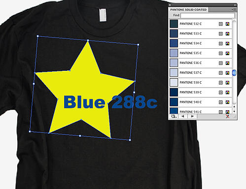
5. SOME COLORS ON DARK GARMENTS
Inks have varying degrees of transparency. A few color ranges are very transparent and do not look good when printed on an under base. This can leave the areas employing these colors looking splotchy, washed out and generally poor. Darker blues tend to be one of these and, unless you’re printing on white garments, avoid using them. Super bright fluorescent inks are very transparent and tend to lighten up and lose brightness when printed on an under base.


Leave a Reply
Your email address will remain private and will not be shared.