


Digital printing on dark t-shirts or garments is not quite the same as printing on white or light ones. The direct-to-garment process is similar to screen print in that a white foundation or white under base must be printed first, allowing the design colors to be visible. Color may not look quite as bright when an under base is used, and the feeling of the printed shirt is not as soft.
In the process of direct-to-garment printing there is an additional step involved with printing the under base. It’s called “the pre-treat.” Colored or dark garments require the print area to be sprayed or treated, with a non-toxic primer. This primer facilitates the bond between the white ink and the garment or material surface. Depending on the design, a pre-treat can double the amount of time it takes to produce a digital print order. Although the pre-treat solution is non-toxic, it can leave a faint residue on the shirt, and it is strongly recommended that these shirts be washed before wearing.
Submitting the Artwork
Once you’ve got a good substrate to print on, put some art on it! Any artwork, napkin drawings included, or art file can be printed on apparel digitally. It is simply a matter of converting the file to the proper format. Your decorator can take care of that part for you, however, there may be an associated art charge. To avoid any redraw or conversion charges, submit your file in one of the following formats:
Adobe Illustrator (ai, eps, pdf) - Fonts should be converted to outlines and linked files embedded or supplied separately.
Adobe Photoshop (psd, eps, tiff, jpg) - Images must be created or scanned at a minimum of 150 dpi at the size images will print.
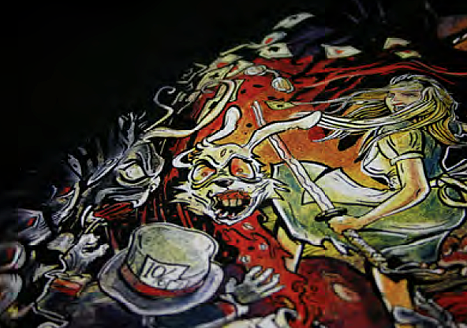
Digital printing on apparel is ideal for reproducing painterly designs and photographic images. Some solid fill areas print beautifully, but not all colors you view on your computer monitor are able to be replicated exactly when direct-to-garment printing. The computer approximates the target color based on what the printer can accomplish with mere CMYK colors. Bright blues, purples, browns, and dark greens tend to appear muddy. This is most noticeable when designs or logos have large fill areas of specific colors.

-1.png?width=280&name=Sharprint%20Decorated%20Apparel%20Logo%20(40%20KB)-1.png "Sharprint Decorated Apparel Logo (40 KB)-1")